Northwest Colorado Survivor Services. Rebranding the Mission.
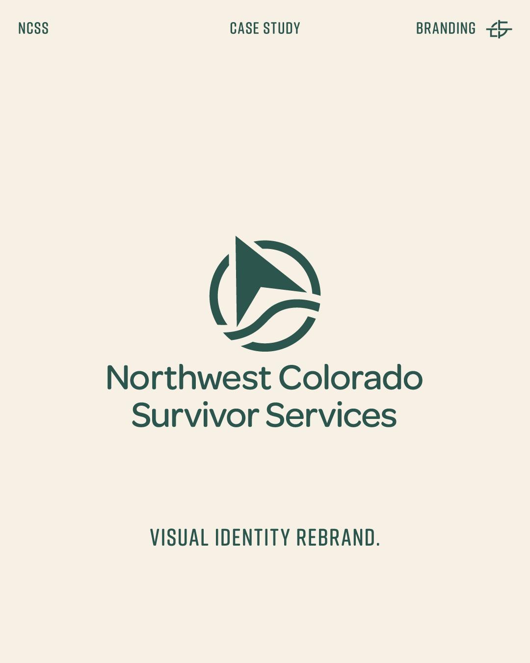
How I rebuilt the visual identity for Northwest Colorado Survivor Services from the ground up — and why it mattered.
There are projects you take on because the work is interesting. And then there are projects you take on because the work is important.
Northwest Colorado Survivor Services is the latter. NCSS exists to support survivors of domestic violence and sexual assault across Northwest Colorado. Their team shows up every day for some of the most vulnerable people in our region. The work they do is serious, trusted, and deeply rooted in the community.
Their brand wasn't showing any of it.
A brand that doesn't reflect your mission is working against you
— even when your work is exceptional.
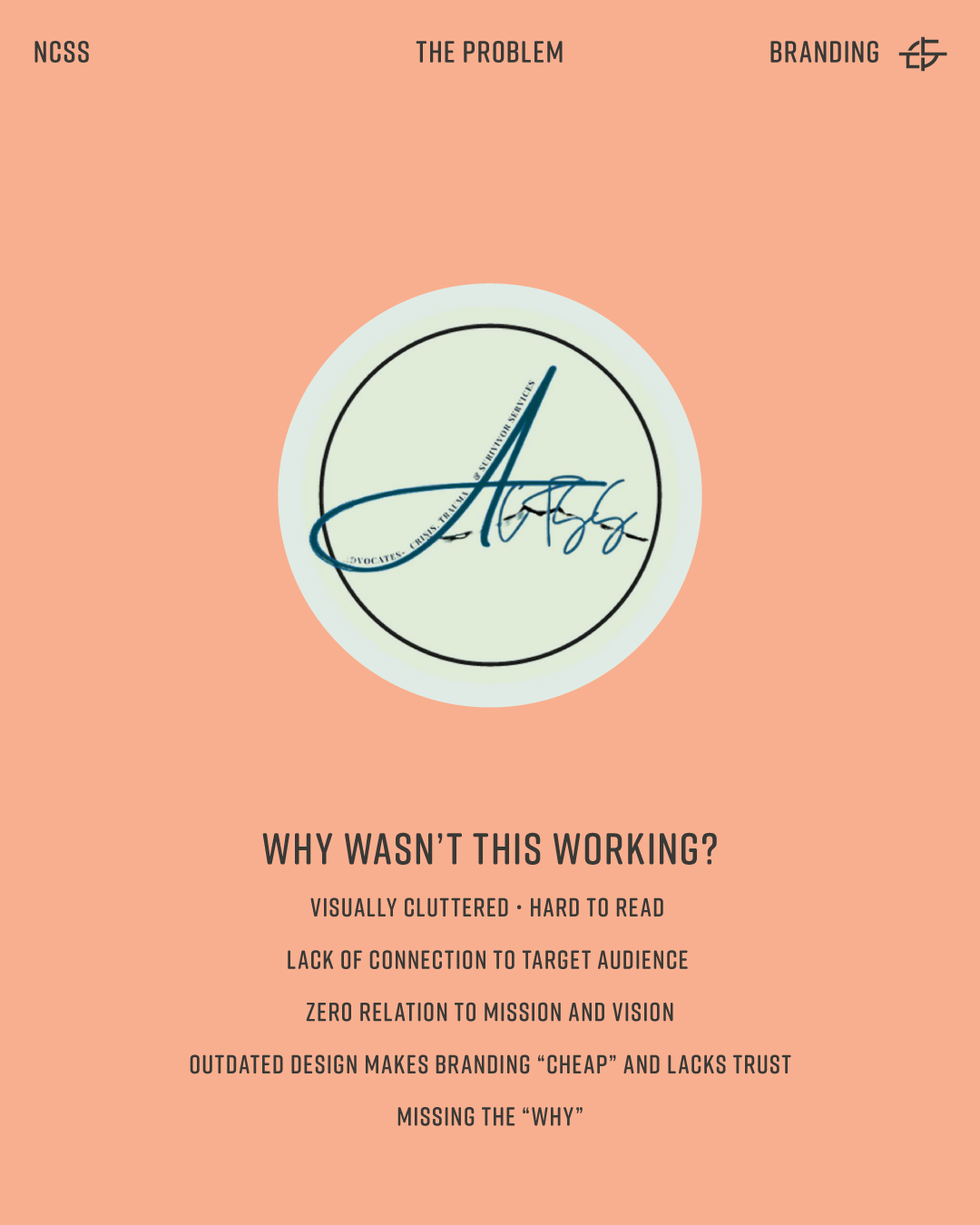
When NCSS came to me, they had a logo that was visually cluttered, hard to reproduce, and disconnected from who they actually are. It wasn't their fault — it was an old design that had never been built as part of a strategy. But for an organization asking the community to trust them with vulnerable people, that gap between their mission and their visual identity was costing them credibility they couldn't afford to lose.
Visually cluttered - Hard to reproduce at small sizes - No connection to mission or region - Generic script font signals "amateur"
The Problem With the Old Brand
The previous logo was a script monogram inside a circle. Decorative. Generic. It communicated nothing about Northwest Colorado, nothing about survival, nothing about community. At small sizes it was illegible. On dark backgrounds, it disappeared.
More importantly, it hid the Why.
In StoryBrand terms, a brand's visual identity should communicate the organization's purpose before a single word is read. The old NCSS logo said nothing. For an organization whose entire value proposition is built on trust, showing up with a brand that looks like a personal Instagram handle was a real problem.
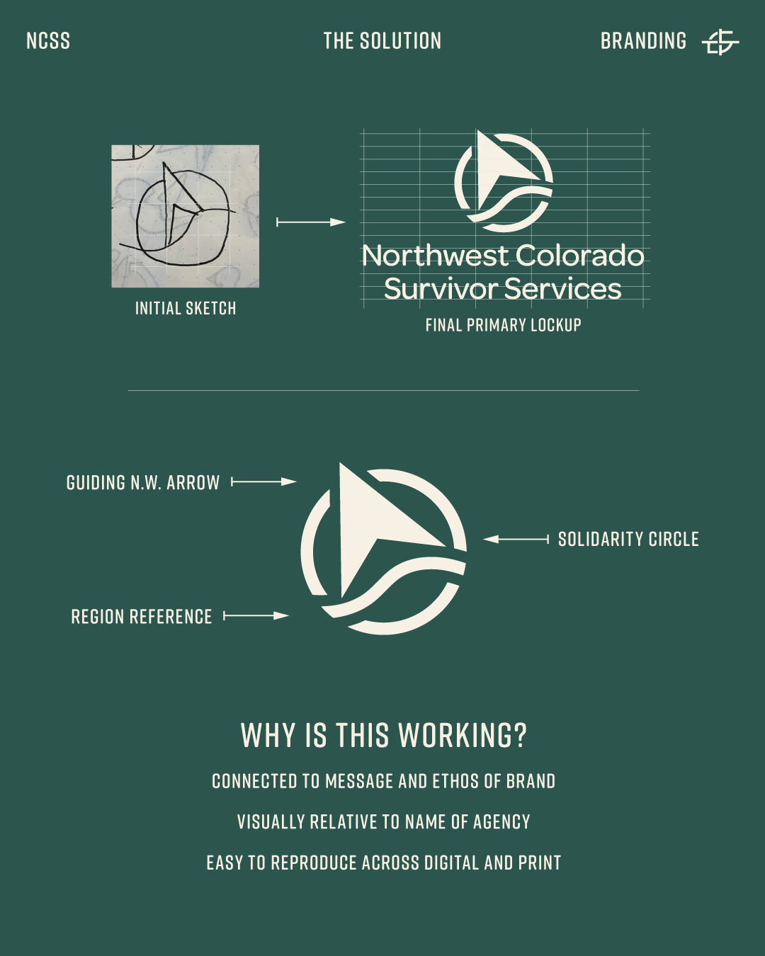
Guiding arrow = direction + hope - Solidarity circle = community + protection - Region reference = rooted in NW Colorado - Roof in Negative Space - Scalable across digital and print
The Strategy Behind the New Mark
I didn't start with aesthetics. I started with questions.
What does NCSS actually stand for? What do survivors need to feel when they encounter this brand? What does the organization want the community to feel? What has to be true about this logo for it to earn trust at first glance?
The answers drove every design decision:
The guiding arrow points forward — direction, hope, movement out of crisis. It speaks directly to what NCSS provides survivors: a way forward.
The solidarity circle wraps the mark — representing community, protection, and the organization's commitment to surrounding survivors with support.
The region reference grounds the mark in Northwest Colorado — this is not a national template, this is a local organization with deep roots in a specific place and community.
The full system — color palette, typography, logo suite, brand standards — was built to work across every touchpoint: digital, print, signage, apparel, and everything in between.
This is what brand strategy looks like when the mission actually drives the design.
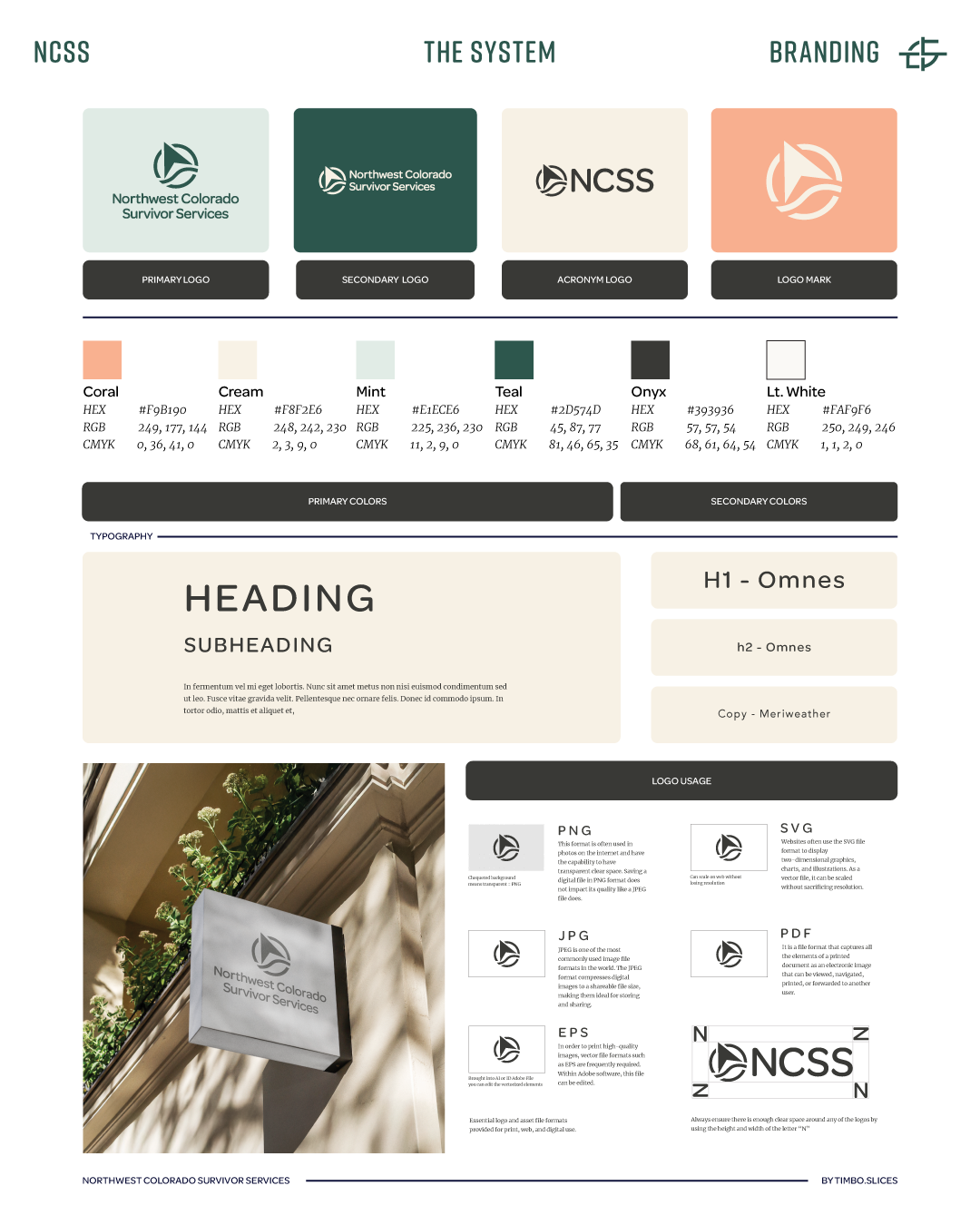
The full NCSS brand system including color palette, typography, logo suite, and brand standards.
Why This Matters for Any Organization or Business
NCSS is a nonprofit. But the lesson here applies to every business and organization on the Western Slope.
Your brand is the first thing people see before they decide whether to trust you. A logo that looks like it was built in an afternoon tells your audience — consciously or not — that the organization behind it might not be serious. That you might not stick around. That you might not be worth the investment.
That's a lot of weight for one mark to carry. Which is exactly why it needs to be built right.
A brand system is not a luxury. It's the foundation everything else runs on. Marketing works harder when the brand is solid. Sales conversations get easier. Clients come in pre-sold because your visual identity already did the work.
That's what we built for NCSS. And it's what I build for every client.
READY TO REBRAND?
If your brand is not telling the right story about your business or organization, we should
talk. At Timbo.Slices, I build brand systems that communicate who you are before you say a word.