Branding Systems & Identity: Building a Grounded Brand Identity for Chris Ray Coaching
Overview
Chris Ray Coaching is a men’s coaching brand rooted in presence, integration, and lived experience. When Chris came to me, the goal wasn’t just to create a logo or pick colors. The goal was to build a clear brand strategy and visual identity system that reflected how he actually works with men, families, and communities.
This project started from scratch. Together, we developed a full brand foundation, defined his audience, clarified his positioning in a crowded coaching space, and translated all of that into a grounded, flexible visual identity system that could grow with the brand.
This case study breaks down the strategy, design decisions, and final outcome—and shows how this same process can help small businesses and service-based brands across the Western Slope of Colorado stand out with clarity and confidence.
The Challenge
Like many coaches and service-based business owners, Chris had depth, experience, and a clear philosophy—but his brand didn’t yet communicate that clearly.
The main challenges were:
Standing out in a crowded men’s coaching and wellness market
Avoiding performative or overly aggressive “alpha-masculine” branding
Creating a brand that felt grounded, human, and relational
Building something that could scale across coaching, retreats, merchandise, and digital platforms
Without a clear strategy, even strong services can get lost. The solution wasn’t louder marketing—it was alignment.
The Brand Strategy Process
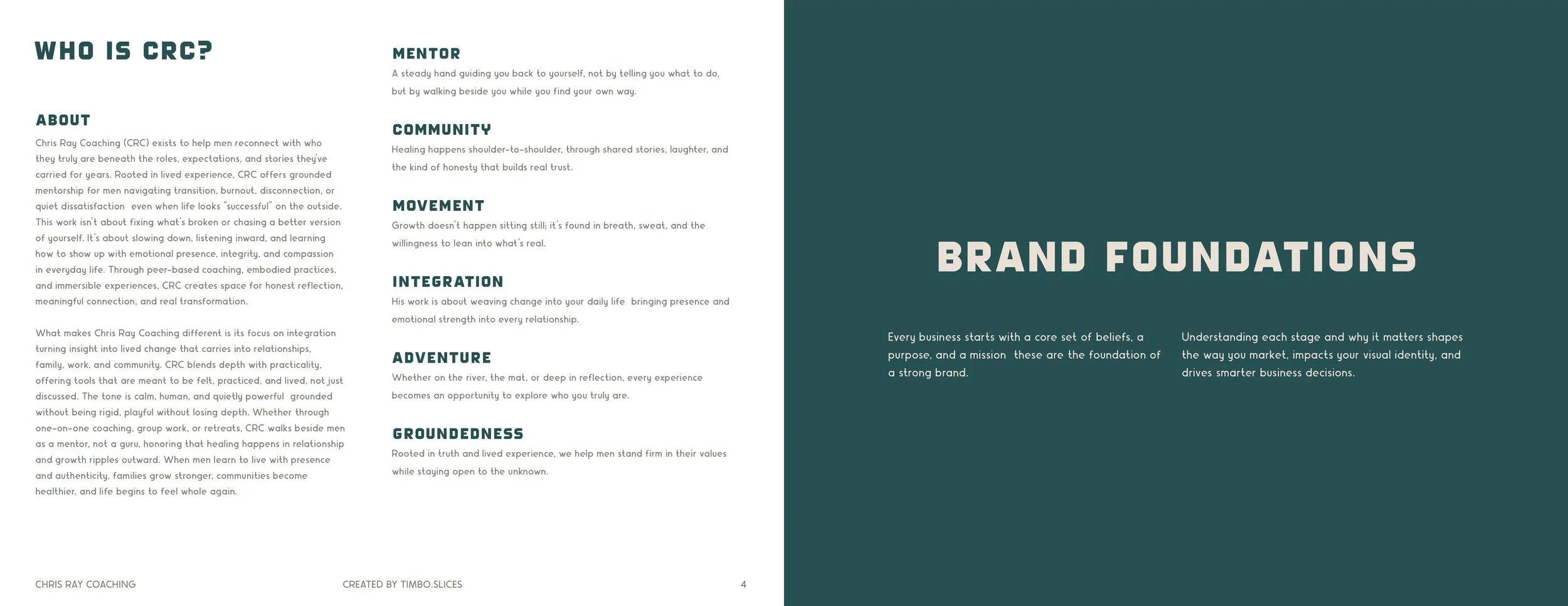
Every strong visual identity starts with strategy. Before touching design, we worked through a complete brand foundation, documented in a formal brand guidelines system CRC_BrandGuidelines-December2025.
Brand Foundations
We clarified:
Purpose, mission, and long-term vision
Core values like shared experience, integration, groundedness, and community
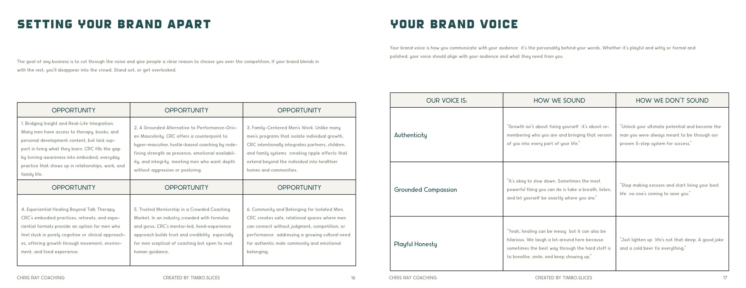
What truly makes Chris Ray Coaching different in the coaching landscape
A key insight was that CRC isn’t about fixing men - it’s about helping them integrate growth into real life. That insight became the backbone of both the messaging and the visual direction.
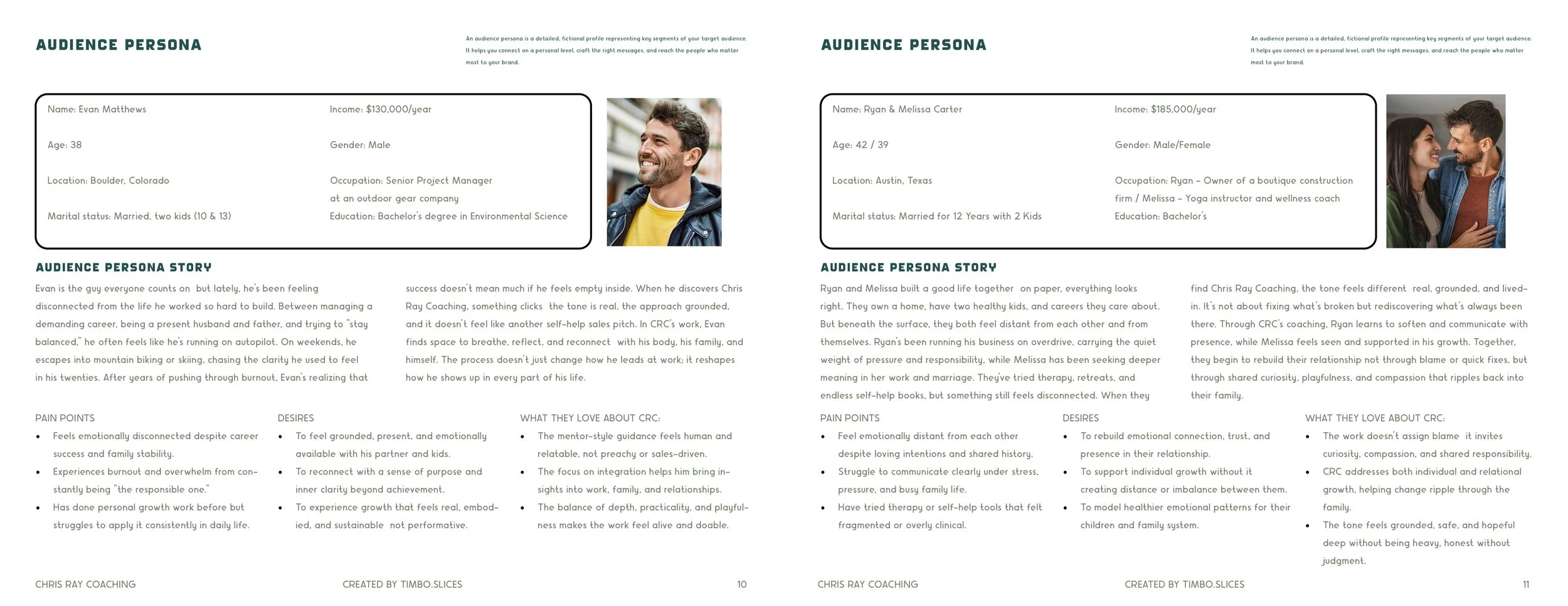
Target Audience & Positioning
Rather than trying to speak to everyone, the brand focuses on men who appear successful on the outside but feel disconnected internally—often professionals, fathers, and partners navigating burnout or transition.
We built detailed audience personas to guide tone, language, and design decisions. This ensured the brand felt:
Approachable, not sales-driven
Calm, not clinical
Strong, without aggression
This positioning helps CRC stand apart from formula-driven coaching programs and creates trust from the first interaction.
Translating Strategy Into Visual Identity
Once the strategy was solid, we moved into visual identity design.
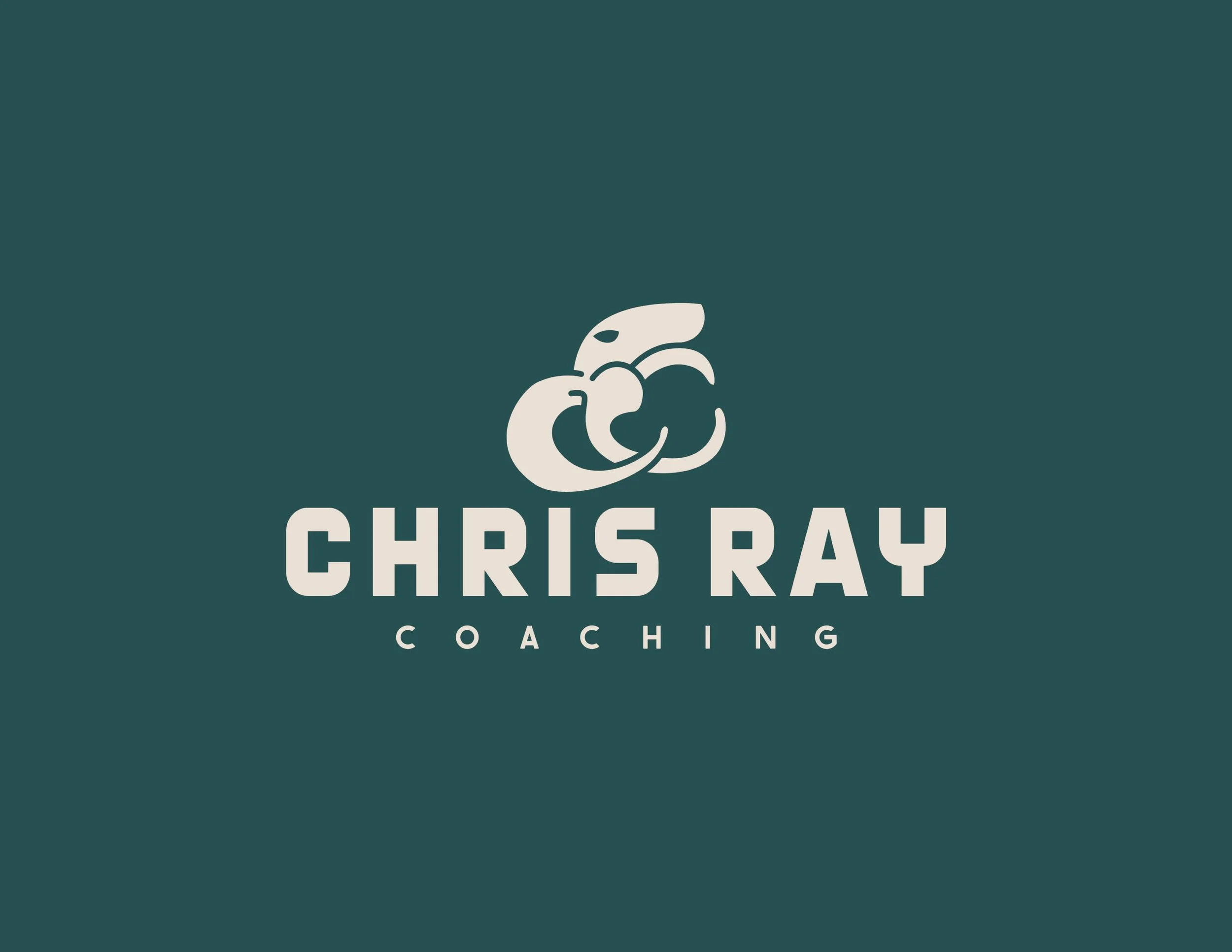
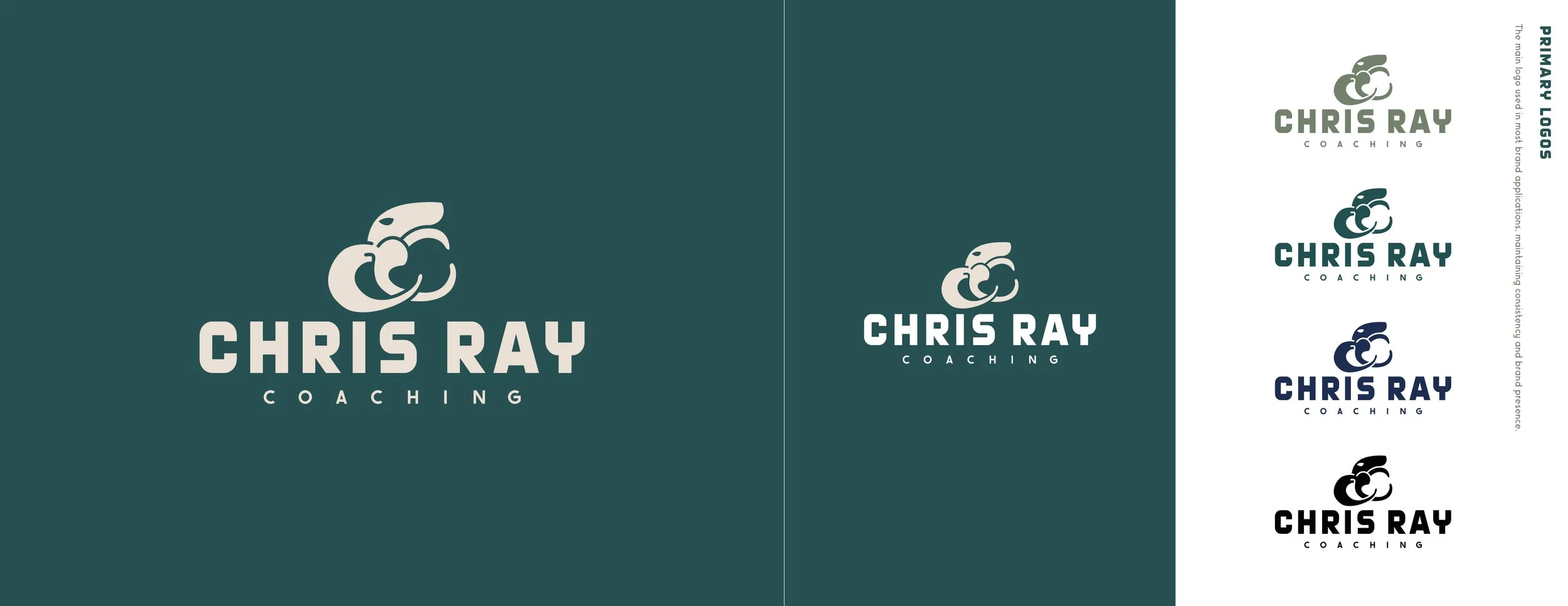
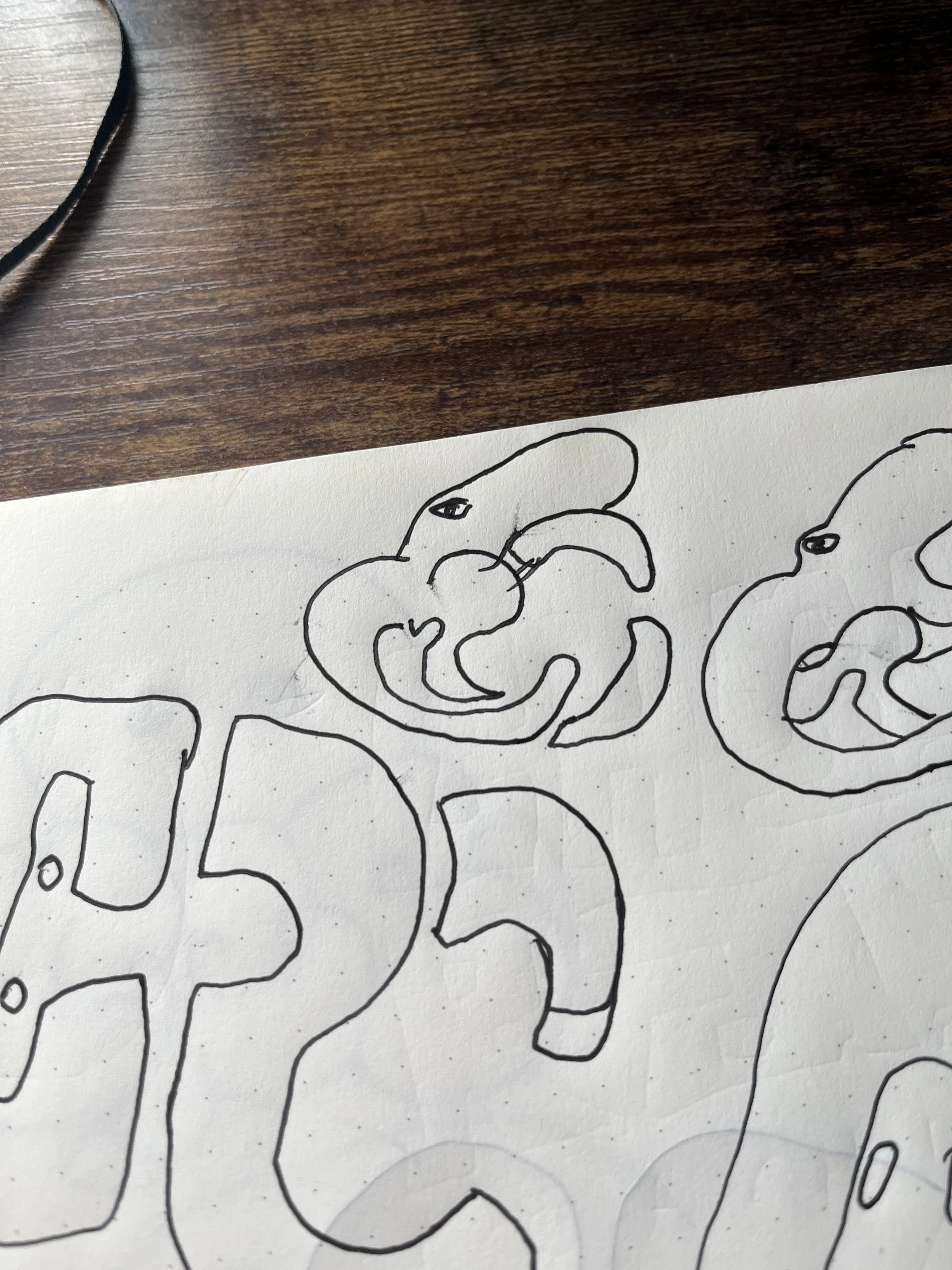
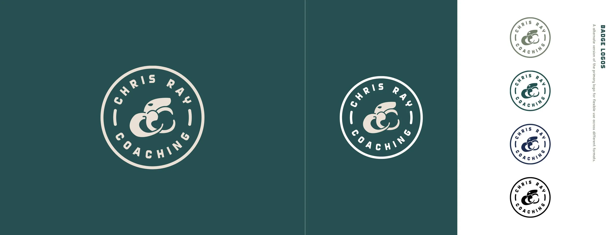
Logo System
The logo mark was designed to feel:
Organic and human
Balanced and grounded
Symbolic without being literal
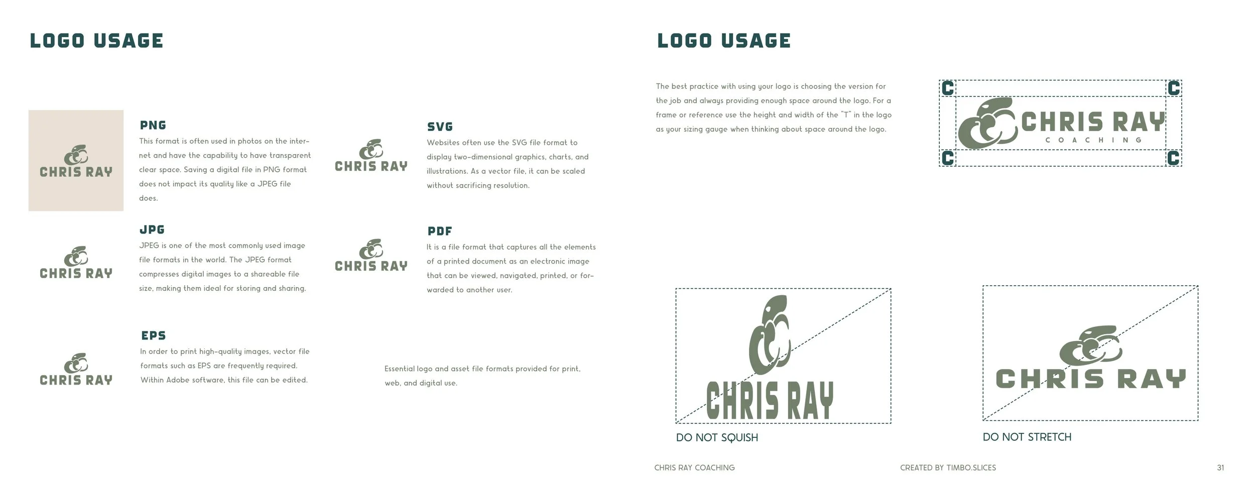
The full logo system includes primary, secondary, and badge variations so the brand can show up consistently across websites, social media, print materials, apparel, and live experiences.
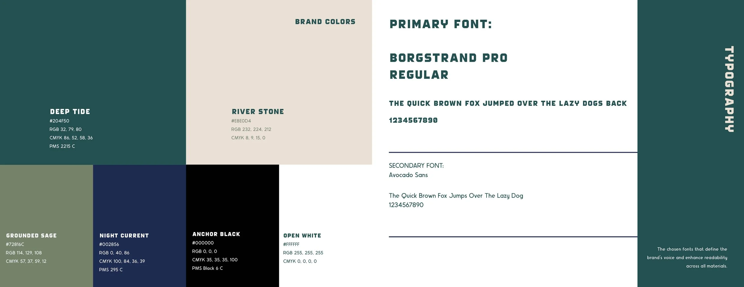
Color Palette
Inspired by nature and grounded environments, the palette uses deep greens, soft neutrals, and dark blues. These colors reinforce calm, trust, and depth—qualities central to Chris’s coaching approach.
Typography
The typography balances structure and warmth, pairing a strong primary typeface with a clean, readable secondary font. This keeps the brand legible and flexible while still feeling intentional.
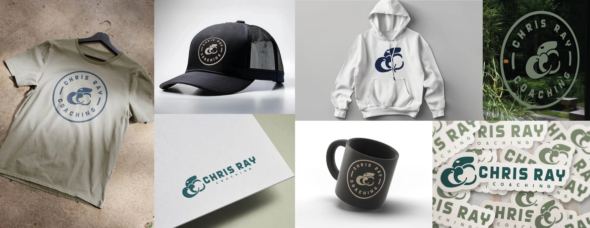
Brand in Action
A strong brand system doesn’t live in a PDF- it shows up everywhere.
For Chris Ray Coaching, that meant:
Apparel and merchandise that feel wearable and authentic
Clean, consistent digital applications
Photography direction rooted in real connection, movement, and environment
Everything was designed to support growth, not limit it.
Why This Matters for Western Slope Businesses
For small businesses and service providers across Grand Junction, the Western Slope, and rural Colorado, clarity is everything. You don’t need louder branding - you need aligned branding.
This project is a clear example of how:
Brand strategy creates confidence
Visual identity builds trust
Consistency helps the right clients self-select
Whether you’re a coach, creative, contractor, or local business owner, a thoughtful brand system makes your work easier to sell and easier to scale.
The Result
Chris Ray Coaching now has:
A clear, documented brand strategy
A flexible visual identity system
Messaging that reflects lived experience
A foundation built for long-term growth
Most importantly, the brand finally feels like the work Chris does every day.
Looking for the Same Clarity?
If you’re a business owner or creative on the Western Slope of Colorado and your brand feels unclear, inconsistent, or outdated, this process works.
I help businesses build:
Brand strategy that actually guides decisions
Visual identities that feel grounded and intentional
Systems that support growth, not trends
If you’re ready to stop guessing and start building with purpose, let’s talk.